Many designs suffer from a lack of structure, making them appear unprofessional and cluttered. Without proper alignment, grid use, and visual hierarchy, the audience struggles to process information effectively. The goal was to create a framework that enhances clarity, balance, and user experience.
By implementing key design principles, we transformed layouts into structured, visually appealing compositions that guided the audience effortlessly.
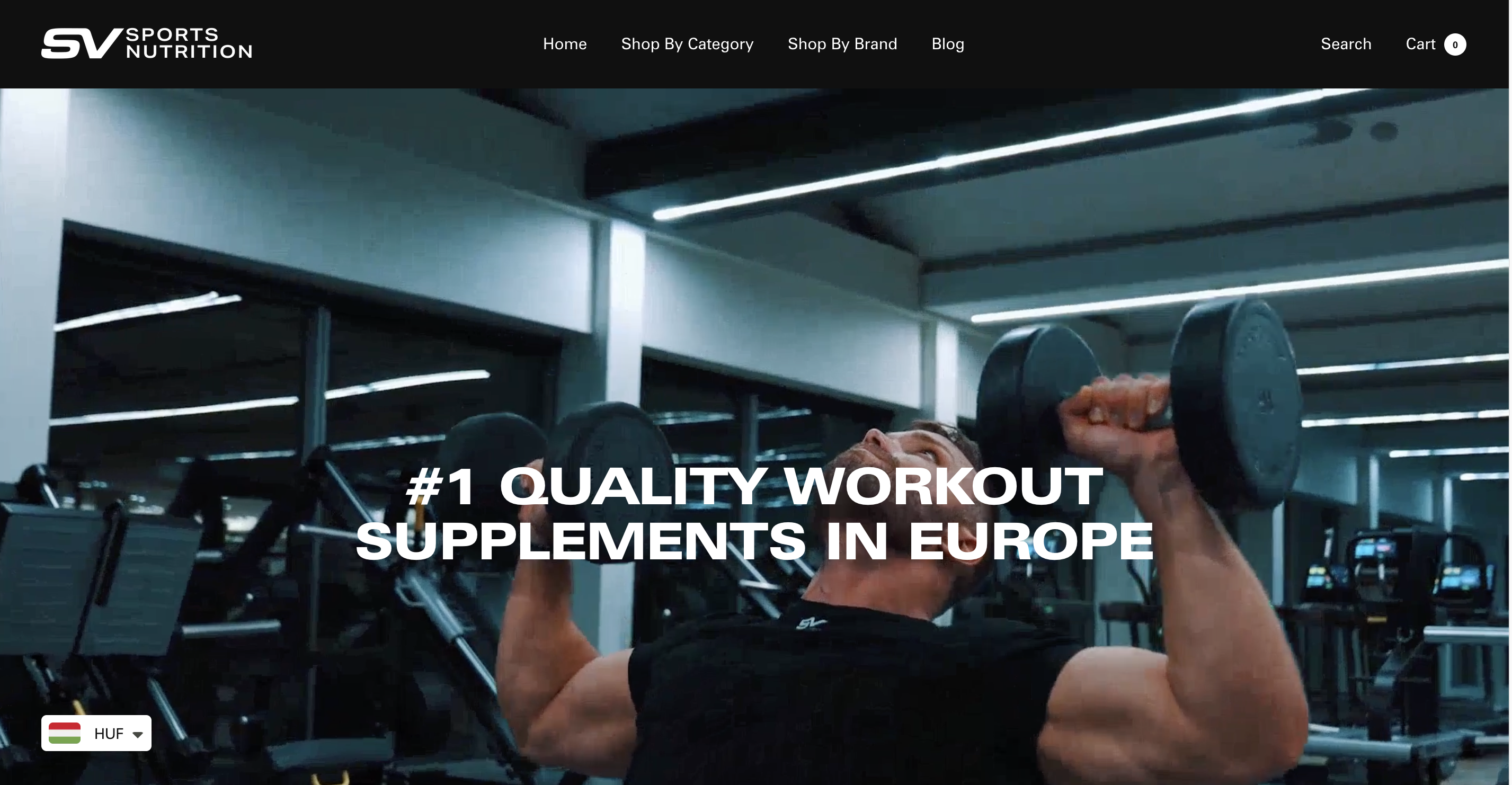
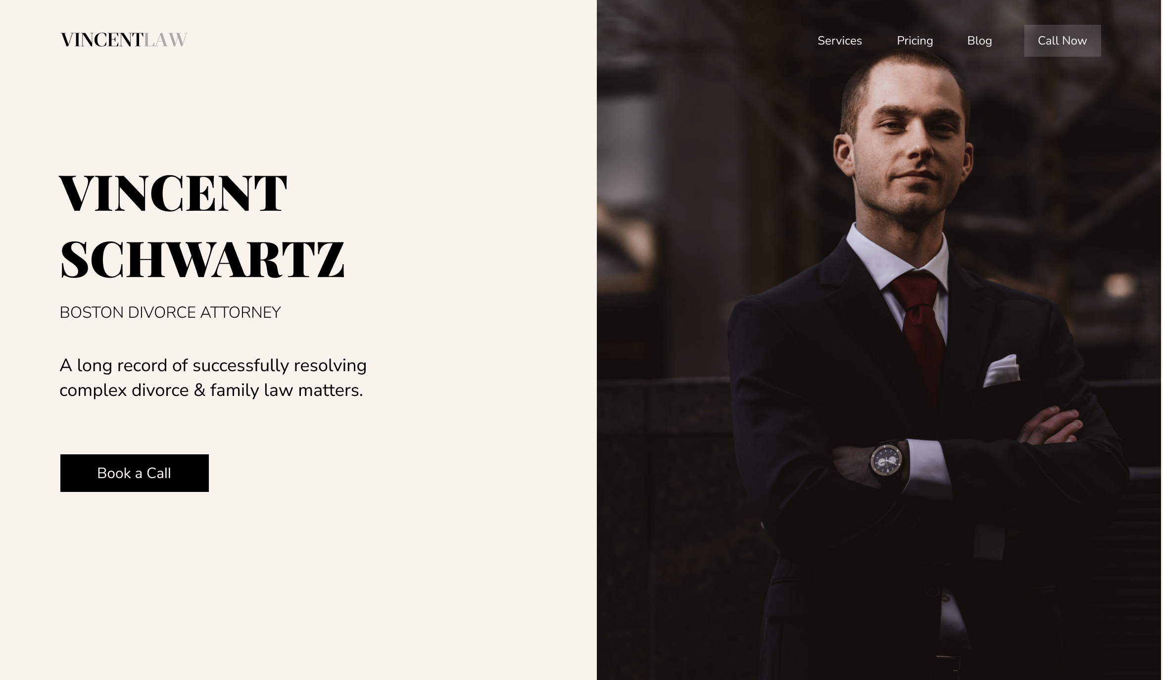
Misalignment often results in a chaotic and amateurish appearance. Simply aligning elements properly can instantly make a design look intentional and professional. The rule is straightforward—stick to a single alignment style per page. For instance:
A well-defined grid helps organize content and achieve balance. We divided pages into equal-width columns, commonly using a 12-column grid with 20-40px gutters. This structured approach ensured:
To guide the audience through content seamlessly, we implemented a strong visual hierarchy. Since people focus on one thing at a time, cluttered designs cause confusion. By prioritizing information, we established clarity:
Grouping related elements improves readability and coherence. We ensured:
Applying these principles resulted in clean, professional layouts that improved user engagement, readability, and trust in the design. By enforcing alignment, grid structures, visual hierarchy, and proximity, we transformed designs from cluttered to cohesive, ensuring a seamless user experience.


"Simple is good."
It's completely free...
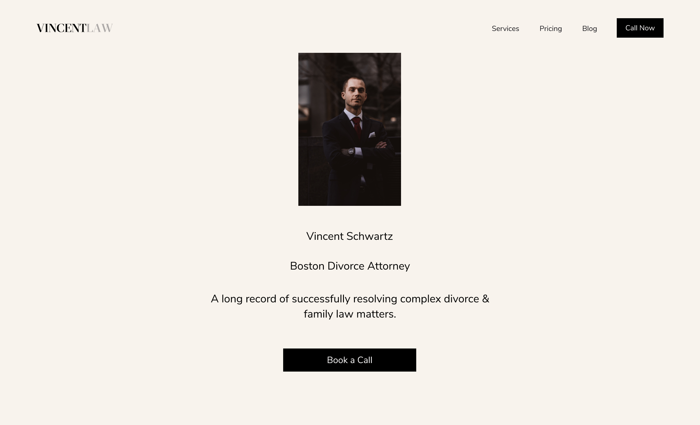
Developed by Vitez Abraham to benchmark your current marketing performance and identify opportunities for profitable payback.
TEST YOUR MARKETING IMPACT