The journey began with crafting a comprehensive project brief. To ensure that every aspect of the project was aligned with the client’s vision, we answered critical questions about the website’s purpose, goals, and audience.
What are we building?
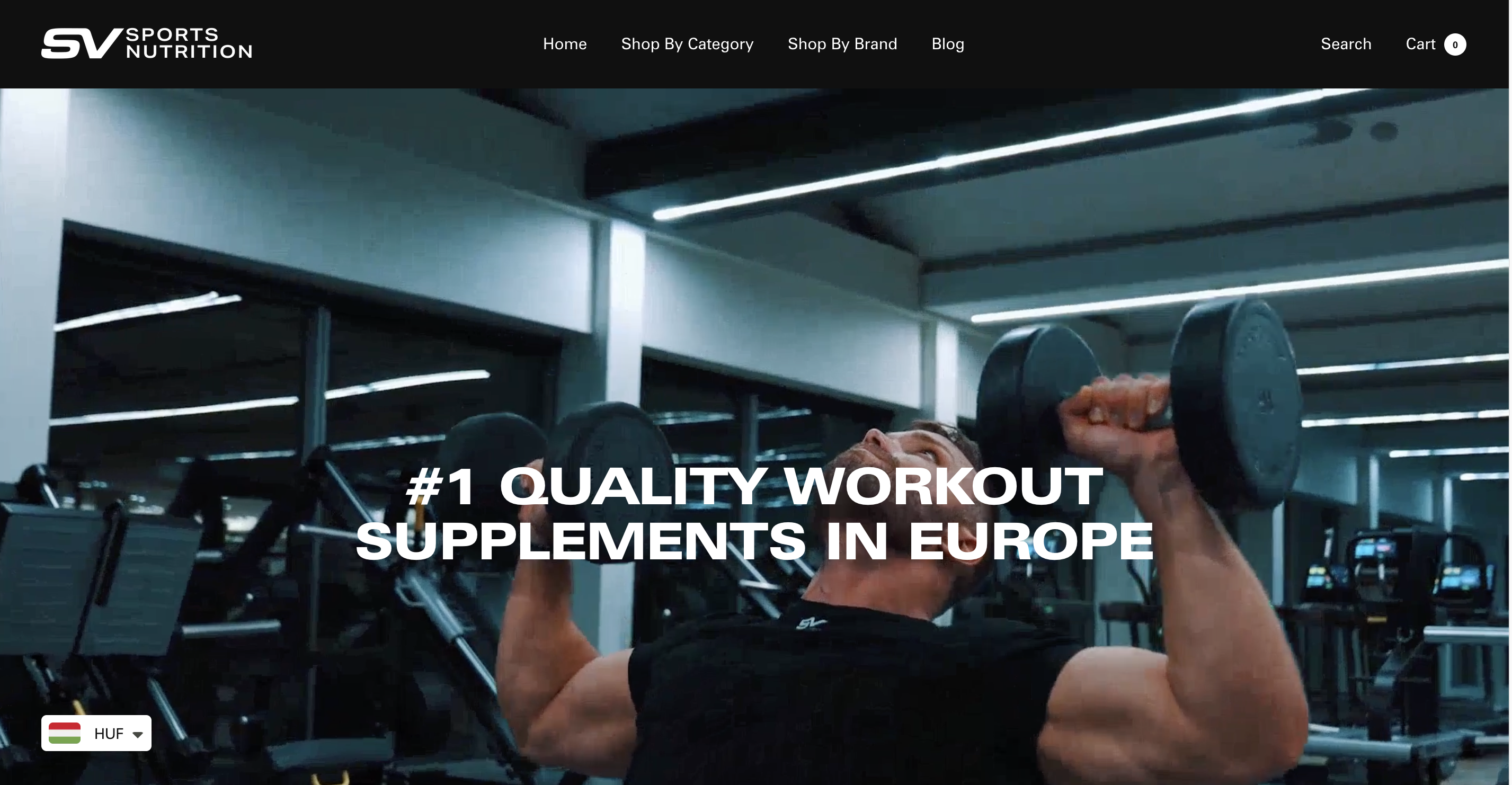
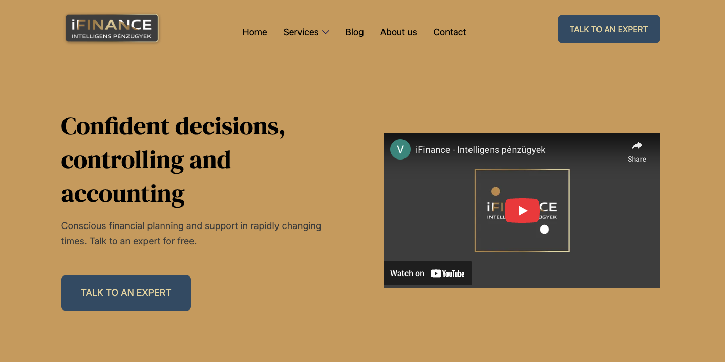
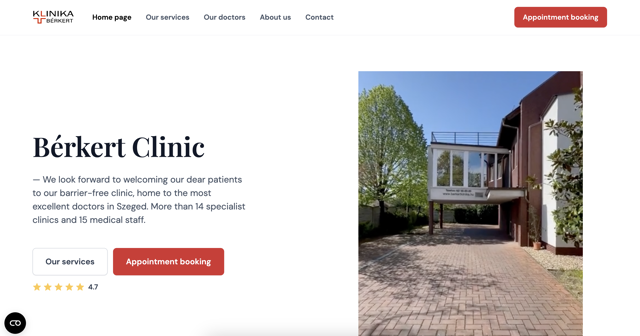
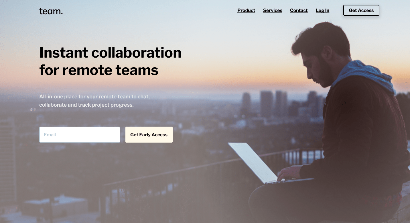
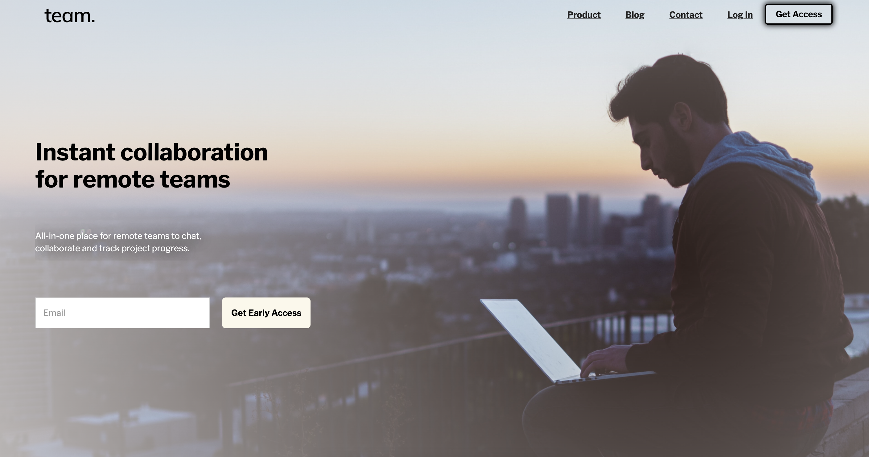
We set out to create a modern, intuitive website for a cutting-edge team collaboration platform designed to streamline communication and productivity.
What’s the goal?
The primary objective was to drive sign-ups for early access to the platform. Additionally, the website would serve as a hub for providing platform information, offering support, and enabling easy contact with the team.
Who’s the target audience?
The site’s target audience was remote teams, startups, and businesses with freelancers or remote workers who thrive in a flexible work environment.
What’s the desired look & feel?
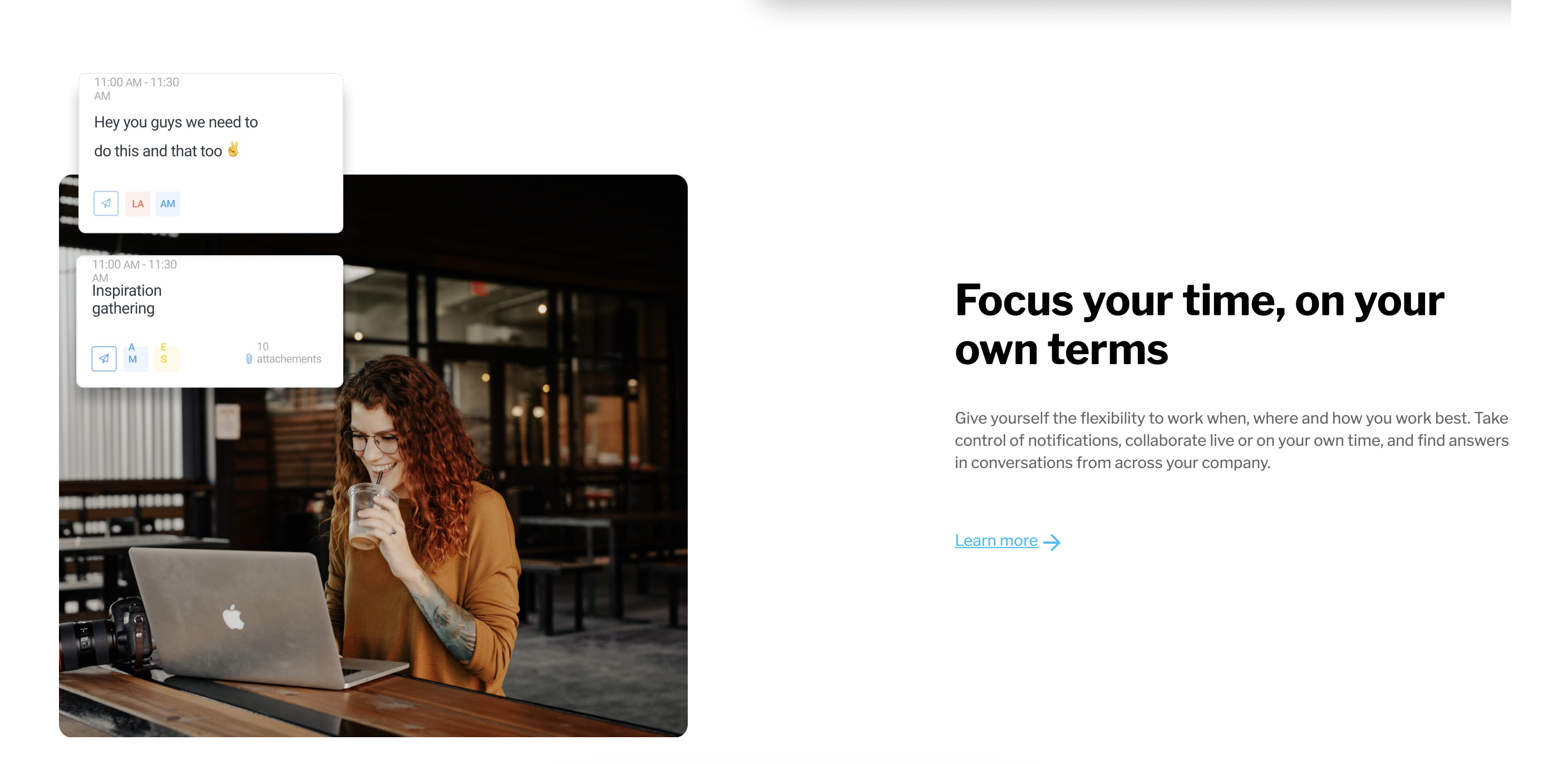
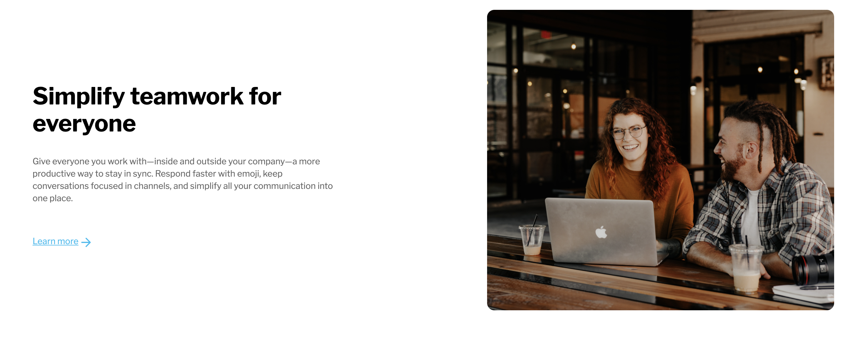
We aimed for a clean, minimalist, and modern design. The look was inspired by leading websites like Slack, Managed by Q, and Taskade—brands that communicate professionalism with a user-friendly design.
Any specific functionality?
The website was designed to include features such as a blog, form submissions for early access registration, and a newsletter subscription to keep users engaged.
To align the team on design direction, we compiled a mood board that acted as our creative compass. This board included examples of websites with the clean, modern feel we aimed to replicate, helping us ensure the right tone from the start.
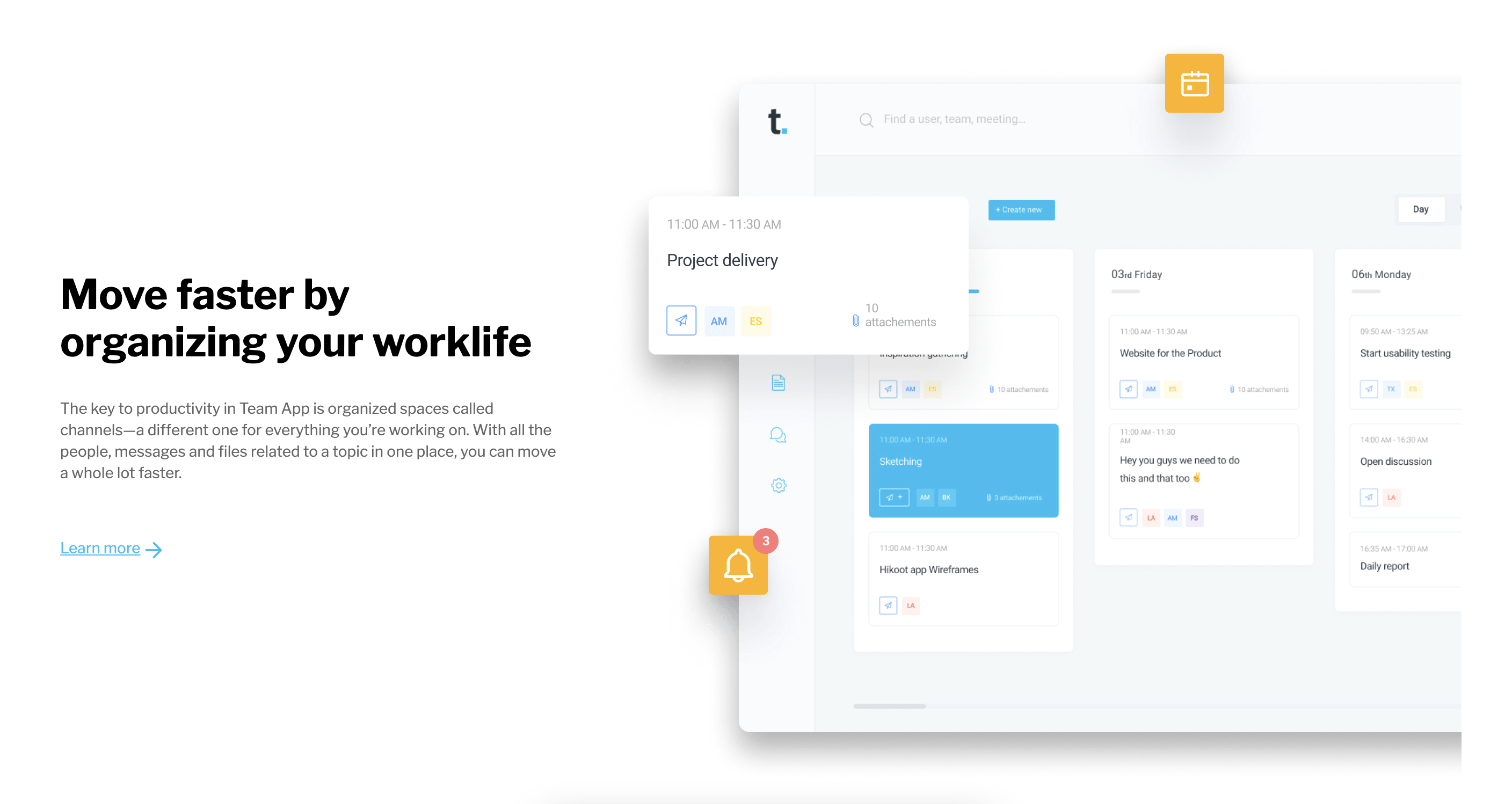
Wireframing served as a crucial stage in the project. It allowed us to visualize the structure and layout of the website before diving into the details. This process also helped in defining the content placement, ensuring we had a clear vision of the website's flow.
In this phase, we used placeholder text, but I also provided fully developed copy where necessary to ensure that the content aligned with the design.
With the wireframe in place, we shifted our focus to refining the design. This stage involved choosing the color palette, editing images, and adjusting the overall aesthetic to create a visually compelling site.
The design aimed to evoke a sense of professionalism and ease of use while maintaining a modern look that appealed to our target audience.
For more details on the design process, you can explore other projects I've worked on.
The next phase was transforming the design into a fully functioning website using Webflow. Known for its speed, security, and integrated development tools, Webflow provided an optimal environment for this project.
Throughout development, we ensured that the site was responsive, functional, and aligned with the design vision. Fine-tuning occurred along the way to ensure a polished end product.
Once the design was approved, we launched the site on a custom domain to ensure it was accessible to users and optimized for a seamless experience.
For a deeper dive into the Webflow development process, please refer to my other projects.
This case study illustrates the journey from the project brief to the final website launch. It showcases the importance of strategic planning, creative inspiration, and collaboration throughout the process. Ultimately, this website was designed with a focus on driving user engagement and facilitating the growth of the platform’s brand.
If you're looking to embark on a similar digital marketing journey or need assistance with your website and marketing strategies, feel free to reach out. I’m here to help you build your digital presence and achieve your marketing goals.
"Accessible design is good design."
It's completely free...
Developed by Vitez Abraham to benchmark your current marketing performance and identify opportunities for profitable payback.
TEST YOUR MARKETING IMPACT