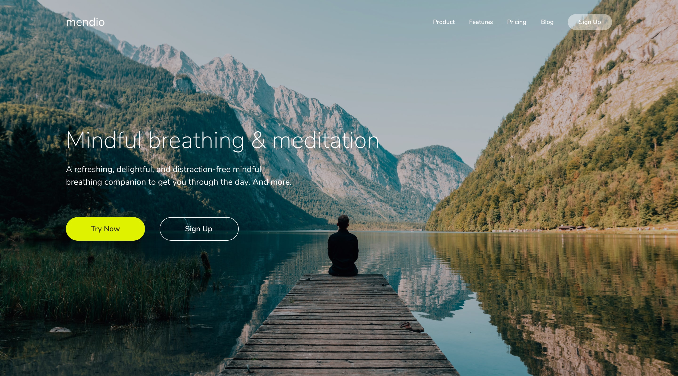
A great photo can dramatically enhance a design, but when used as a background, it often reduces the readability of the content placed on top. Ensuring both visual appeal and legibility is crucial in digital design.
To address this challenge, I implemented two techniques: Image Overlays and Tinting, effectively balancing aesthetics with functionality.
Adding a semi-transparent color overlay on top of the background image enhances contrast and improves text readability. The process includes:
For a more creative and stylized effect, I used tinting, which involves:
Implementing these techniques led to:
By utilizing Image Overlays and Tinting, I was able to transform cluttered and hard-to-read layouts into visually cohesive and engaging designs that effectively communicate their intended message.


"One picture is worth a thousand words."
It's completely free...
Developed by Vitez Abraham to benchmark your current marketing performance and identify opportunities for profitable payback.
TEST YOUR MARKETING IMPACT