Overview: When I embarked on this project, the primary objective was to create a visually engaging and functional website that resonated with Chat App's core values. By carefully integrating typography, imagery, and color, I crafted a seamless user experience that significantly elevated the brand's digital presence.
Typography: Setting the Digital Tone
The journey began with selecting the right typeface that would encapsulate the essence of Chat App's values. After careful consideration, I chose Rajdhani, paired with Roboto.
- Rajdhani, with its digital feel, made an excellent choice as the display typeface for headlines. This selection set the tone for the entire design, establishing a modern and technologically sophisticated look that aligned perfectly with the brand’s tech-driven identity.
- Roboto provided the necessary readability for body text, ensuring clarity while complementing the bold presence of Rajdhani.
Image Selection: The Synergy of Design and Imagery
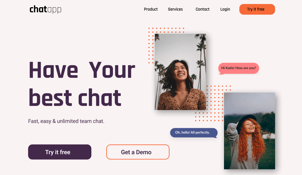
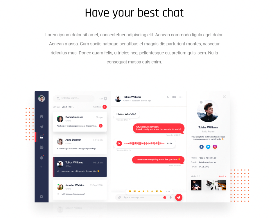
Selecting the perfect images was pivotal to the design process. I prioritize the synergy between imagery and design elements, so I handpicked the project images before deciding on the color scheme.
- This approach ensured that the images felt integrated with the overall design, enhancing the website's aesthetic cohesion and setting the right visual tone from the outset.
Color Selection: Harmonizing with Images
Building upon the images, I focused on selecting a color palette that complemented the visuals. I chose colors that could be found within the imagery itself, reinforcing the brand’s consistency and creating a seamless flow throughout the website.
- The color choices harmonized with the images, offering a balanced and engaging design that kept users visually connected with the brand’s story.
Website Structure and Design: Crafting a Seamless User Journey
With the typography, imagery, and colors in place, I turned my attention to the structure of the website, focusing on clear navigation and user engagement.
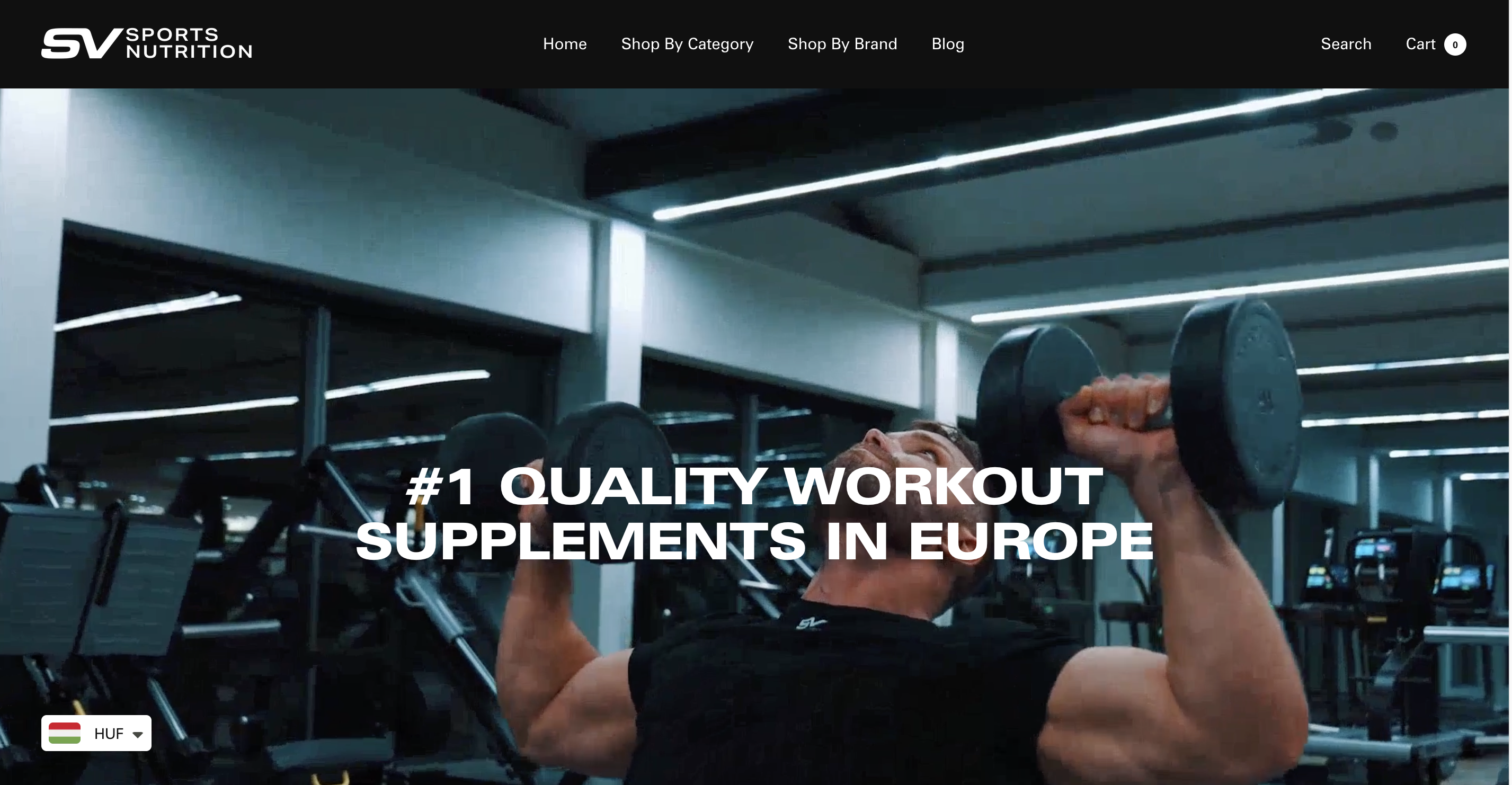
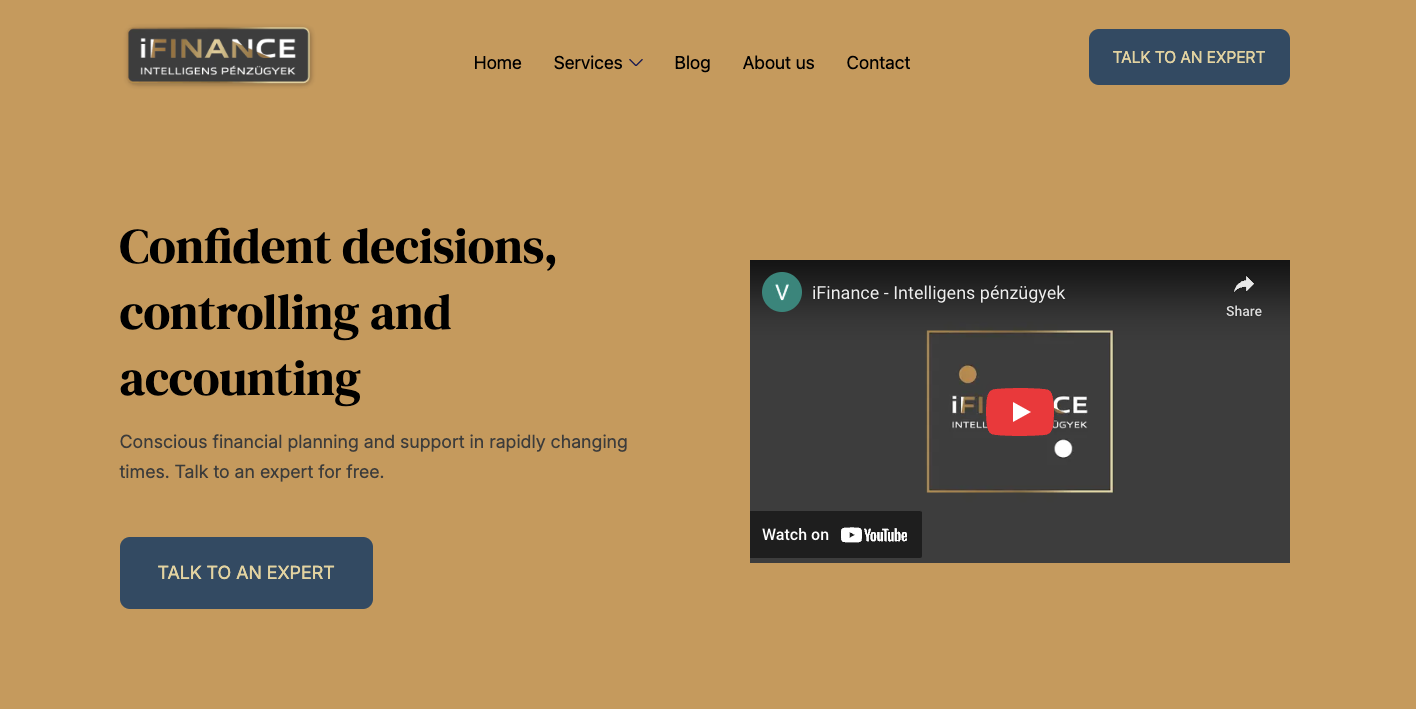
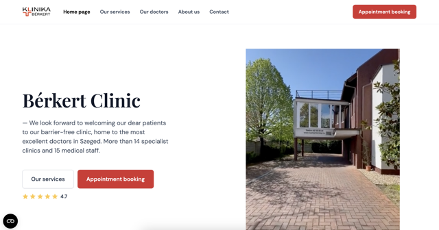
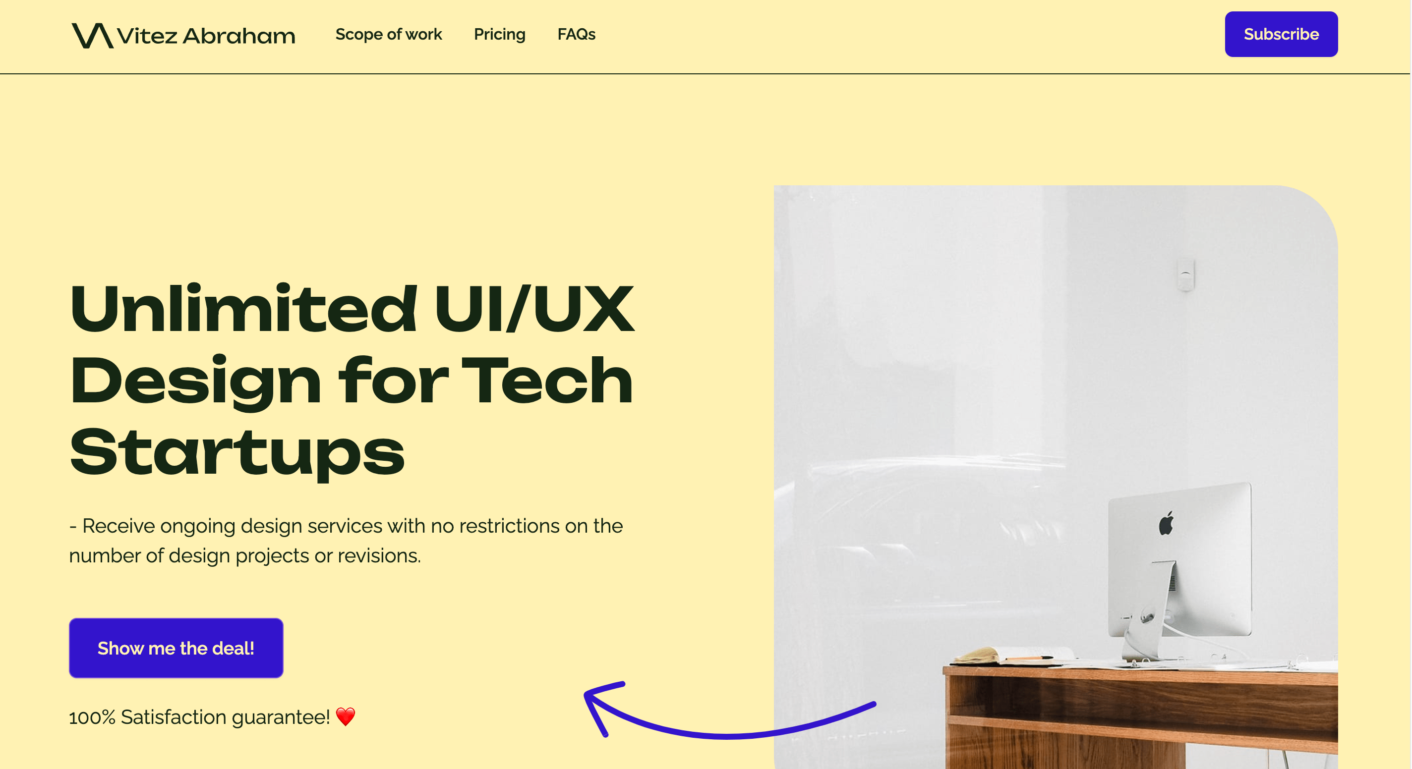
- Header: The header, located at the top of the page, was carefully crafted to include essential elements such as the logo, products, services, contact info, login, and a compelling call to action. This ensured users could navigate easily and understand the brand’s offerings immediately.
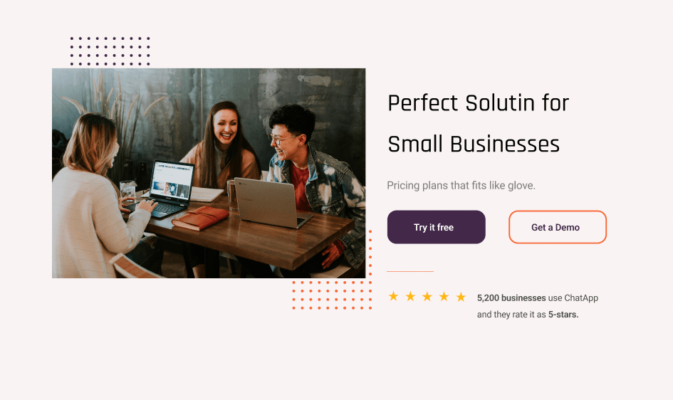
- Hero Section: The hero section was designed to captivate visitors, featuring strategic call-to-action elements, a user-friendly layout, and an overall visual appeal that drew users in and encouraged engagement.
- Content Section: The content section succinctly described Chat App's business and highlighted key user benefits, weaving a compelling narrative that engaged visitors and encouraged further exploration.
- Call to Action Section: I created clear and compelling call-to-action buttons to drive users to engage with Chat App’s offerings, ensuring the transition from visitor to customer was smooth and intuitive.
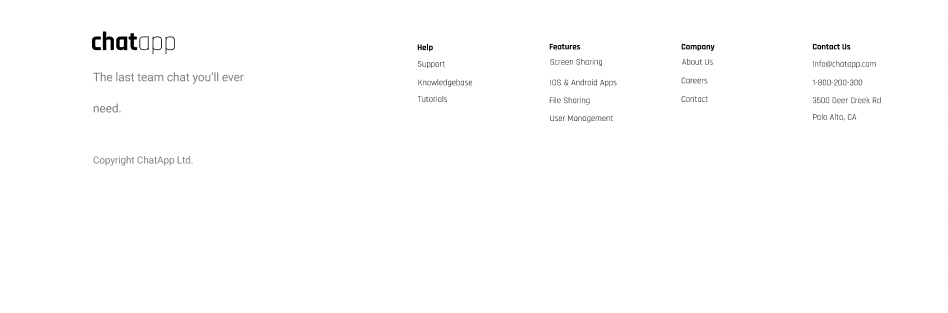
- Footer: The footer rounded off the website with a clean summary of the brand’s offerings, contact information, and legal terms, including GDPR, reinforcing the website’s professionalism and trustworthiness.
Attention to Detail: Consistency Across All Touchpoints
Throughout the design process, my focus remained on consistency. From spacing to alignment, every element was carefully considered to ensure a seamless and intuitive user experience. This attention to detail helped create a visually cohesive design that users could easily navigate.
Results: Driving Sales and Brand Growth
The integration of typography, imagery, and colors in perfect harmony transformed Chat App's digital presence, leading to impressive results:
- Increased User Engagement: The user-friendly design and captivating content led to a significant increase in user engagement.
- Higher Conversion Rates: Strategic placement of call-to-action elements led to higher conversion rates, driving more users to take action.
- Brand Consistency: The consistent design approach ensured that Chat App’s brand image remained cohesive across all touchpoints.
- Boosted Sales: With increased engagement and higher conversions, Chat App experienced a substantial boost in sales.
Conclusion
This case study demonstrates the profound impact of a meticulously crafted design process. By focusing on typography, image selection, and color harmony, I was able to create a website that not only resonated with Chat App's values but also drove measurable results in user engagement, conversion, and sales.
As a skilled and experienced digital marketing entrepreneur, I am dedicated to delivering creative, collaborative, and innovative solutions that foster sales and brand growth.
Would you like to discuss how I can help transform your brand’s digital presence? Let’s connect and explore the possibilities.